


Share this article
Table of Contents
There are many factors that contribute to the success of a customer referral program: a consistent email marketing campaign, attractive referral rewards and incentives, and a conversion rate-optimized referral page.
The referral landing page is the focus of this guide.
To help you build a referral page that potential customers can't resist, let’s review
- how referral pages (and, in general, landing pages) differ from web pages,
- why incorporating a referral page in your referral program's flow is essential to its success,
- and how to align your referral page with conversion rate optimization (CRO) best practices.
Why Have A Referral Landing Page?
A referral landing page is a standalone web page that a website visitor "lands" on after clicking a link from Google Search, an online advertisement, an email, or some other form of marketing material like a YouTube video or Instagram post. The main purpose—rather, the single purpose—of a referral landing page is to persuade the visitor to take a desired action, such as making a purchase, signing up for an email newsletter, or, in your case, taking part in a referral program.
What do I mean by single purpose?
Unlike other web pages, like a home page which contains many opportunities for a visitor to explore and navigate a website, landing pages give the visitor finite navigational options—ideally, just one prominently placed option.
To illustrate what I mean, I've grabbed a couple of screenshots.
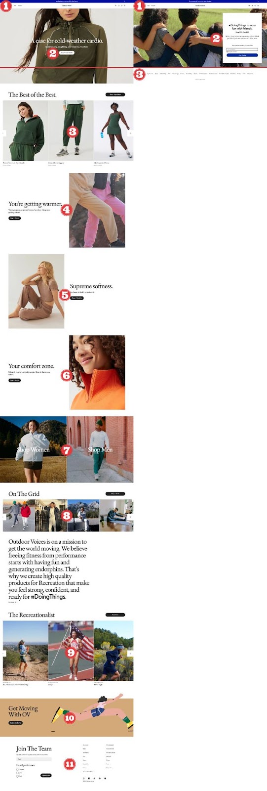
On the left is Outdoor Voice's home page and on the right is the referral landing page they link to from their email campaigns. Using numbers, I've highlighted the different options a visitor has when they land on these two pages. There are eleven choices for the user on the homepage and just one choice on the landing page.
And the red line shows what lies below the fold. What lies above the red line is what a visitor will see when they land on the web pages, before scrolling down the page.
Right off the bat, you'll notice a few things:
- Aside from the menu and navigational options at the top of the web page, the landing page contains a single field signup form that includes a headline, a short description, and a CTA button.
- While at first glance the home page looks very similar, when a visitor scrolls down below the fold, you can see it is about 8-10x longer than the landing page with multiple navigational options, including links to various product pages, an about us page, and links to Outdoor Voice's various social media channels.
- In comparison, when looking below the fold of the landing page, all you'll find is a minimalist footer section containing limited navigational options.
All of this to say, compared to other web pages like a home page, landing pages are specifically designed to give visitors a finite number of navigational options—your referral page should be no different.
The reason(s)?
- The fewer opportunities a visitor has to navigate somewhere else, the more likely they are to take the desired action,
- to align with conversion rate optimization (CRO) best practices, and
- to avoid subjecting your potential and existing customers to choice paralysis.
We'll discuss these reasons and more below.
5 Data-Driven Rules For A Great Referral Landing Page
We recommend that a referral landing page follow these five data-driven rules for creating a referral landing page that converts.
1. Identify Goals Of A Referral Page
The goals of a referral program landing page are fairly simple:
- Expand a referral program’s email list
- Boost customer referrals
- Improve customer retention
- Increase revenue
Expand a referral program's email list
Referral pages are excellent at extending the reach of your referral program's email list. According to research from Annex Cloud, customer referral programs can secure up to 20,000 new email addresses per month.
Impressive, but how?
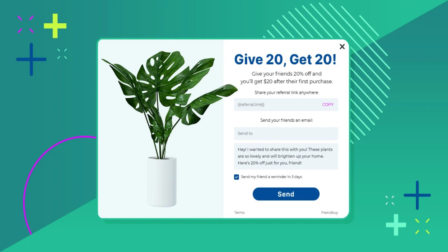
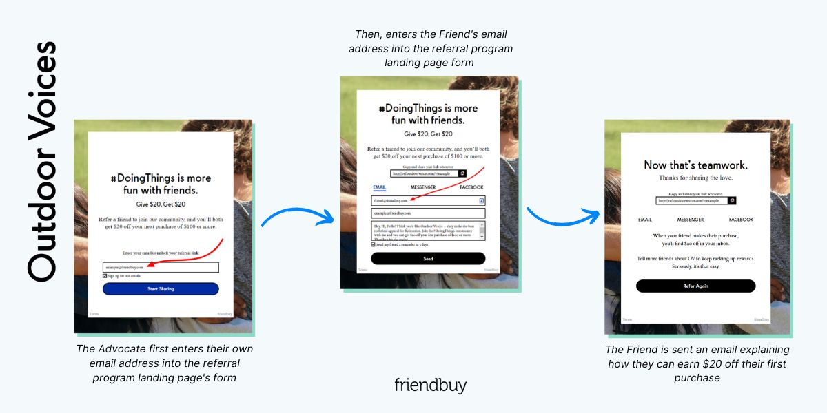
Well, looking at Outdoor Voices' referral flow once again, first, the Advocate enters their own email address into the referral landing page's signup form and hits "Start Sharing". The Advocate then enters the Friend's email address into the referral program landing page signup form. Once the Advocate hits "Send", the Friend is emailed describing how they can earn $20 off their first purchase. Both the Advocate's and Friend's email addresses are automatically added to Outdoor Voice's referral program's email list.
What's the benefit of this?
If you use a referral flow similar to this, if the Friend converts, you've gained a sale and both parties' email addresses. If the Friend doesn't convert, now you have both the Advocate's and Friend's email addresses. With these details, you have the opportunity to convert both parties into paying customers during a future campaign.
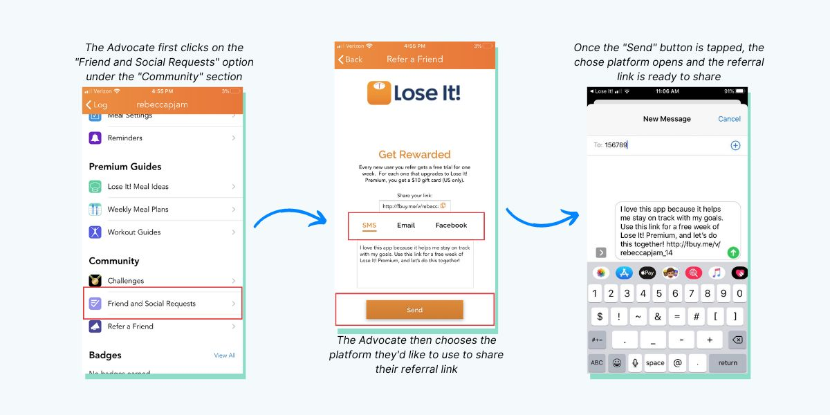
And as a bonus, Outdoor Voices' referral flow also generates a referral link that the Advocate can copy and share with whomever they like and wherever they like—whether that be on their social media channels, through direct messaging apps, or via email.
How to track emails:
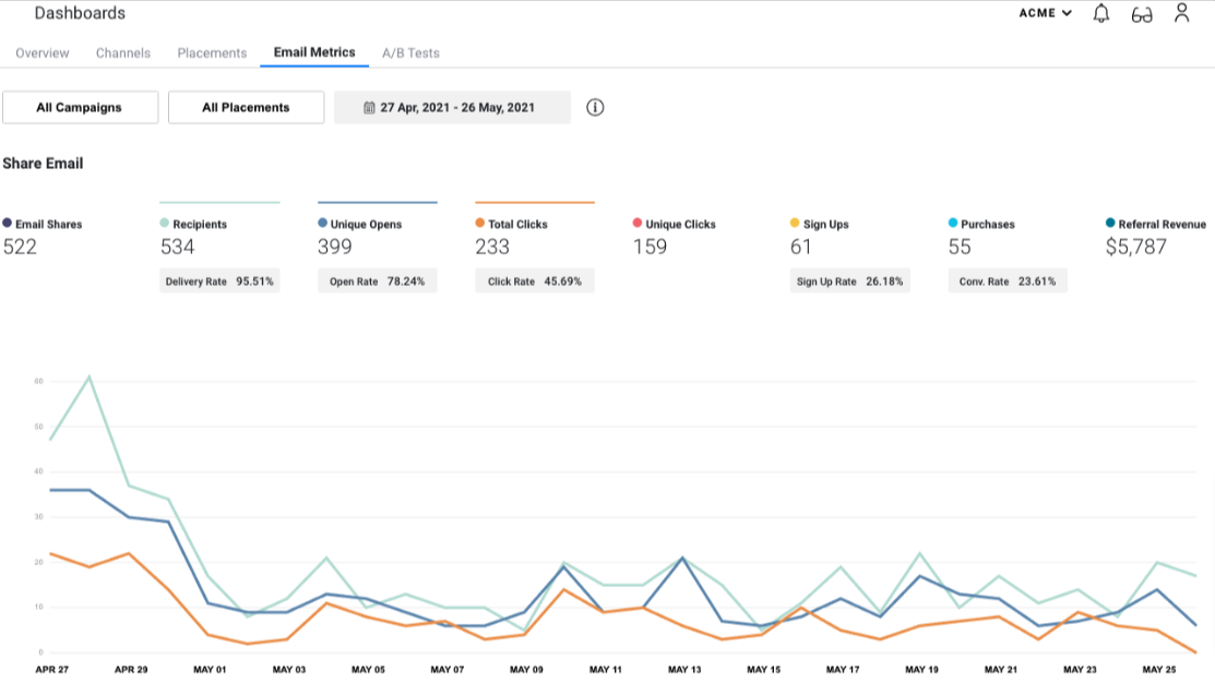
From open rates, clicks, and generated revenue, our referral dashboard allows users, like yourself, to track a wide range of email metrics with a single mouse click.
Learn more: check out email metrics here.
Boost customer referrals
If there is one thing landing pages are good at, it's converting prospective customers into paying customers. According to Databox, the average landing page conversion rate is 26 percent. That means that for every 4 people that land on your referral page, 1 will convert.
They're pretty good odds.
Conversion rates this high aren't by accident, though. In fact, if you want your referral page to convert at this rate, there are certain best practices you should adhere to.
I cover these in the below "Conversion Optimization" section.
How to track customer referrals:
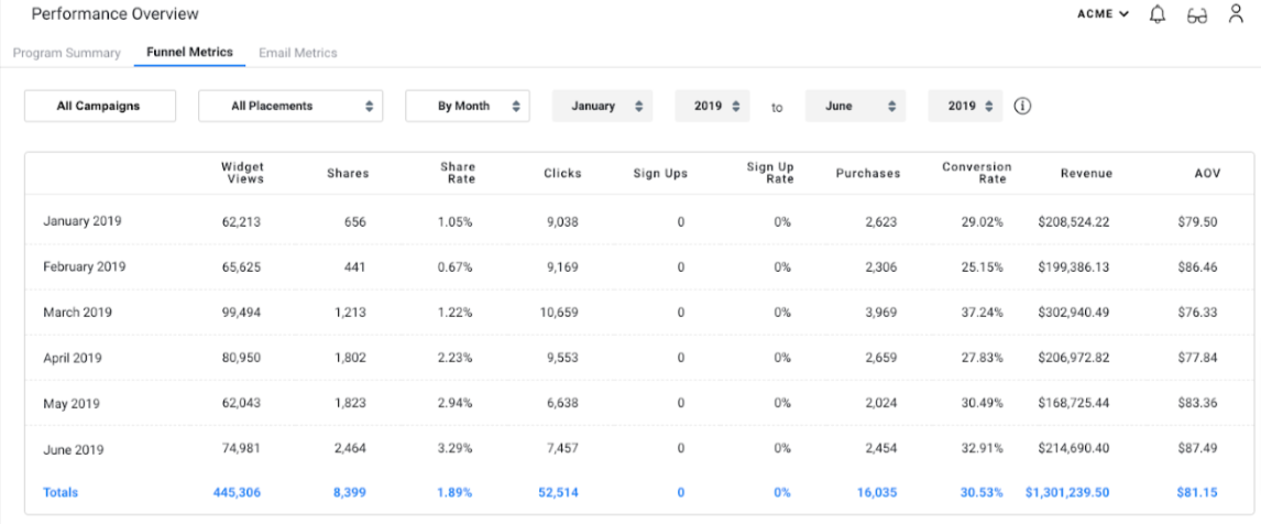
Our platform's dashboard allows users to track customer referral metrics, such as share rate, sign-up rate, and conversion rate.
Learn more: check out funnel metrics here.
Improve customer retention
Many marketing campaigns focus on customer acquisition over customer retention. While attracting new customers to your business is important, the real value of a customer base lies in your loyal, existing customers.
This is where referral programs, thanks to the help of referral pages, really shine. In fact:
- Referred customers have a 37 percent higher retention rate than customers acquired by other means.
- With a similar time of acquisition and demographic, on average, the lifetime value of a referred customer is 16 percent higher than non-referred customers.
- Return customers spend around 33 percent more than new customers.
How to track customer retention:
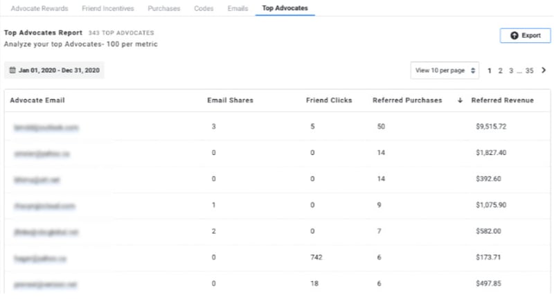
Friendbuy's referral platform also allows users to track customer retention by allowing access to metrics like email shares, Friend clicks, referred purchases, and referred revenue.
Learn more: check our top advocates report here.
Increase revenue
Referral pages are effective at boosting a business' bottom line. So effective, in fact, that customers acquired through referrals spend up to 200 percent more than the average customer.
Not bad.
How to track generated revenue:
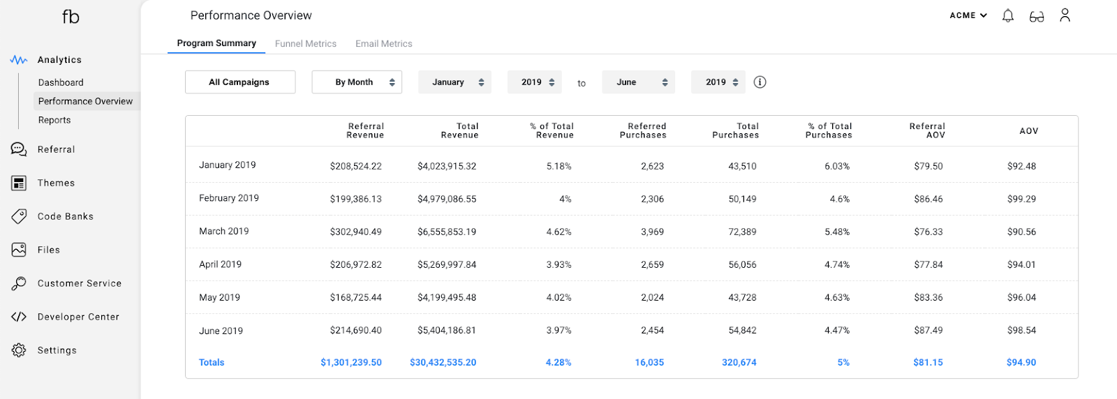
Users can also track generated revenue through Friendbuy's dashboard, this includes access to metrics like referral revenue, percentage of total revenue, and referral average order value (AOV).
Learn more: check out the performance overview here.
2. Use Good, Clear Copy
As we saw with navigational options, the adage "less is more" rings true for referral page copy too. In fact, 30% of landing pages have been found to contain too much copy.
To ensure you don't fall into this same trap, here are some pointers:
- Use Power Words. Power words give your copy punch. For example, "Refer a friend, receive a discount" is concise, but a touch underwhelming. On the other hand, "Refer a friend, get instant rewards" packs that punch that gets customers to click.
- Include A Call To Action. Tight, 2-5 word CTAs typically have the best conversions. Something like "Give and you shall receive", "One good turn deserves another", or "Give $50, get $50" is simple yet very effective.
- Keep It Short and Sweet. Too much fluff and you risk your target audience not reading the written content you've included on your referral page. Over 20 years of ongoing eye-tracking research has so far found that most internet users skim and skip around web pages to find relevant information. Effective copy is clear, concise, and easy to read.
- Use Numbers. Talking about conciseness, using numbers conveys a message with little room for obscurity. Going back to the eye-tracking study, researchers also found that showing numbers in numerical form (rather than in words) is more suitable for online readers.
- Make People Feel Good About Themselves. Don't be afraid to refer to your readers directly, 'cause, guess what? Personalized CTAs increase conversion chances by 202 percent.
Learn more: 11 call-to-action examples
Headline
Aside from a quick side glance at a landing page’s imagery, the headline is the very first thing potential customers read when they land on your referral page. That's why it needs to be clear, concise, and to the point.
Your headline should also cover all of the following bases:
- Prioritize message match. The headline of your referral page and the copy that follows should reflect the tone and voice of your brand. It should also match the marketing material used to bring a potential customer to your referral page.
- Don’t underestimate brevity. On average, an internet user's attention span has dropped to about 8.25 seconds. That's not a lot of time to convince a potential customer it’s worth their while to take part in your referral program.
- Use familiar phrases, expressions, and sentences. Think of your headline as a commercial. You want it to be catchy, familiar, and relatable.
Description
While a headline is the hook, your description's purpose is to elaborate on what your referral page is all about and to drive home further the benefits your referral program is offering.
A suitable description will tell your target audience exactly what they'll get by referring their friends and family to your referral page.
Just like headline copy, good referral page descriptions are clear and easy to read. To do this:
- State the benefits your target audience will enjoy.
- Use short sentences with short phrases. Think 20-40 words max.
- Avoid any jargon or acronyms your target audience might not understand.
Button
The CTA button is central to the conversion funnel of a referral page. It needs to be both legible and noticeable. It also needs to be direct, preferably 2-3 words max, and use familiar expressions (like "Get started", “Start sharing”, or "Refer now").
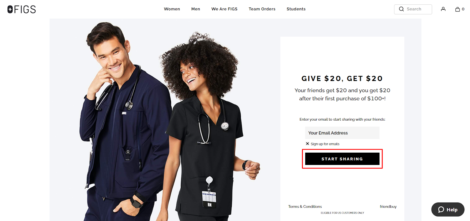
To increase the chances of a click, use terms that convey urgency, suggest a positive outcome (like "earn", "get", or "receive"), and, as we saw with copy, invite personalization, like "Your referral link".
3. Make It Easy To Promote
Perhaps the most crucial aspect of a successful referral page is whether your customers can easily promote it. Our formula for a successful referral program highlights this:
Awareness + Accessibility + Ease of Use = Impulse Referrals
To encourage impulse referrals, a key element a referral page must have to make the promotion of a referral program easy. One of the most effective ways to do this is to use unique referral links.
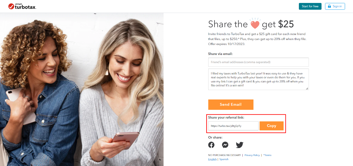
The referred Friend clicks on the referral link that the Advocate has shared. The referral link contains a code that is attributed to the Advocate, which allows you to track when the referred Friend makes a purchase.
To get your customers to share those precious referral links with their Friends, you’ve got to make it easy for them to find.
Make The Page Easy To Get To
To increase the chances of a potential Advocate finding your referral page, it should be highly visible and easily accessible at every appropriate touchpoint.
We recommend that you:
- Include a link to the referral page in the navigation bar and footer of your website.
- Include a link to the referral page in the email marketing communications you send out.
- Include a link in your social media posts.
But promotion doesn’t stop there. Remember that once you’ve got their attention, you’ll need to sell your referral program with something so good they hope their Friends make a purchase.
Other promotional considerations include:
- How easy is it for your target audience to share your referral page?
- Do your referral emails make it easy for recipients to find your referral page?
- Do your social media promotions make it easy for potential Advocates to find your referral page?
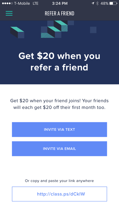
Optimize For Mobile
Over 62 percent of people use their mobile devices to access the internet. This means if your referral page isn’t mobile-friendly, then a good portion of any potential traffic that you drove to your referral page will bounce before they convert.
That’s what we call a leaky funnel.
This highlights why it’s important to consider how your referral page appears on mobile devices when building and designing your referral pages.
Here is what we recommend you do:
- Optimize your headlines, descriptions, and CTA buttons for smaller screens.
- Test your referral pages on multiple mobile devices to see how they load and function on different screens.
- Make good use of white space so that text is easily readable, images are viewable, and icons are easily clicked by users.
Enable Social Sharing
When we say make it easy to promote, we mean two-taps-easy. As in, make your referral page easy to access from everywhere, including social media. Making social sharing as easy as two taps for your potential Advocates to share your referral page with their Friends will boost impulse referrals.
So how do you set it up?
Include social media buttons on your referral page so that potential Advocates can share your referral page on their favorite platforms with ease. The social media platforms you feature will be largely determined by where your target audience "hangs out".
For example, most Advocates will be active on at least one, if not all, of the following platforms:
- Messenger
Send Email Blasts
Quarterly email blasts are email marketing campaigns that promote your referral program to your entire customer base (AKA other potential Advocates).
We recommend sending quarterly email blasts to keep your referral program top of mind with your audience and bump those referral conversions.
With that said, don’t overcomplicate your blasts. Make them simple. We recommend:
- Include one, primary image.
- Include a simple CTA, preferably making use of just two to three words.
- Write a straightforward email subject line to capture your recipients’ attention.
Easy peasy.
Automate Referral Emails
Automated referral emails are simply premade emails that are triggered whenever an Advocate or Friend completes a predetermined action in your referral program. The most common use for automated emails is to email a customer once they’ve processed a transaction or completed a successful referral.
For example, an automatic customer appreciation email sent to top Advocates for completing desired actions, in this case referring a set number of Friends.
Customer appreciation emails aren’t the only emails that can be integrated into your automated email flow. Other referral email automations include:
- Welcome emails.
- Post-purchase emails.
- Referral limit reached emails.
- Post survey emails.
4. Use Conversion Optimization Tactics
To drive sales, encourage customer loyalty, and maximize conversions, every business must educate itself on what it takes to craft high-converting referral landing pages.
There are several factors that have a direct impact on referral conversions. These include:
- Load time. A significant percentage of potential visitors will abandon a referral page if it doesn’t load within 4-5 seconds.
- Colors. Previous case studies have found that the color red is effective in securing conversions—particularly CTA buttons. But it's not a one-size fits all approach.
- Power words. The type of language you use matters. So much, in fact, that a single word has been shown to reduce call-to-action conversions by 26.5 percent.
- Formatting. How a referral landing page is organized also affects conversion rates. In fact, web pages with 5 or more links have a worse conversion rate than web pages with just one link.
- Images. Multiple case studies have shown that using images, particularly pictures of human faces, increases conversions.
- Form fields. Several case studies have shown that the longer the signup process the worse the conversion rates are.
Learn more: check out these 5 tactics to increase referral landing page conversions.
Best load time
Landing pages that have a page loading time of between 0-2 seconds have the highest conversion rates. In fact, a web page that loads in 1 second has a conversion rate 3 times higher than a page that loads in 5 seconds.
To ensure that your referral page loads fast, you can:
- Use a content delivery network (CDN). Most large companies use CDNs to ensure that their websites load quickly. A content delivery network is a distributed network of servers that delivers content to a user based on the geographic location of the user, the origin of the web page, and the content delivery server.
- Minimize HTTP requests. HTTP (hypertext transfer protocol) requests are used for transmitting data between a web browser and a web server. Each element on a web page—including images, scripts, and style sheets—generates an HTTP request. So, if you want to ensure your referral pages load quickly, you’ll want to limit the number of HTTP requests being made.
- Reduce the size of your files. The larger the files, the longer the load time. In order to reduce file sizes, you can use a tool like FileOptimizer to compress files. Content compression is used to compress web pages for faster delivery to web browsers. By compressing your web pages, you can significantly reduce page loading times.
If you want to see how your referral pages are performing, you can use Google's PageSpeed Insights. PageSpeed Insights is a free tool that analyzes your web pages to see how quickly they load.
Best Colors
There's a lot of debate around the use of color and how it impacts conversion rate optimization. One school of thought is happy to die on their "red is the best color" sword—particularly red CTA buttons.
Why?
One study found that using red CTA buttons "...achieves the highest purchase intent for a theoretical loot box in an online video game scenario". The red buttons also affected "the amount participants were willing to pay for the loot box." Further, as Nick Morgan writes for Psychology Today: "...audiences are not aware of the cognitive bias they have for the color red".
While red has been shown to be very effective for conversions, in current published literature, there is a bias toward this color as it has been subject to the majority of color psychology research.
As this study argues, blue and green are worth considering. Both colors are linked to the natural world and have been shown to be associated with positive intent, including peace, openness, and success. In fact, these phenomena aren't lost on the financial sector. Many financially based businesses use green in their branding as it has been associated with health, money, prosperity, and security.
The point is, different colors evoke different emotions in different people. Your audience is the same. My suggestion? A/B test. Roll out different variations of your marketing material that include different colored CTAs and A/B test them to see which converts best.
Best Power Words
Power words (i.e. words that evoke an emotional response) are effective.
Take the word "free," for example.
According to the results of an A/B test conducted by HubSpot, the word "free" boosted the click-through rate (CTR) by 17 percent. Why? Because the word "free" evokes a strong emotional response. And, sure enough, according to HubSpot's study of 330,000 CTA phrases, the word "free" was rated as one of the top phrases associated with an unusually high response rate.
Learn more: Read our referral email subject line guide for a breakdown of the most effective power words here.
Best Formatting
How you format your referral page has a direct impact on conversions. In fact, featuring more than one offer isn’t the best of ideas either. Doing so will decrease conversion rates by up to 266 percent. Further, two-step landing pages experience 30 percent higher conversions than one-step forms.
The best format is one that's clear and concise.
The best-performing landing pages are also devoid of distractions. That means no sidebar, no sidebar CTAs, no sidebar opt-ins, nothing. The best landing page designs simply feature a headline, description, CTA button, and signup form.
Best Images
Images have been shown to increase conversion rates, particularly pictures of human faces.
People are visual creatures, so it makes sense that images are effective. And, thanks to the fact that the human brain can process an image faster than it can read text, adding an image will also increase the amount of information that the reader can consume in a short amount of time.
Learn more: check out why images improve conversion rates here.
Best Form Fields
Form fields can be an effective way of collecting data from your users. But, if you're not careful, form fields can also be a hindrance. In fact, according to case studies, the more fields a visitor has to fill out in a form the lower conversion rates a landing page will achieve.
The solution is to keep the number of form fields to a minimum.
A good rule of thumb is to only include the fields that are absolutely necessary. For referral programs, you'll only need to collect the Advocate and Friend’s email addresses. So that’s two fields. If you’d like to take the personalized approach, which as we’ve seen can improve conversions, two more fields for the Advocate and Friend’s names can be included.
Easy as that.
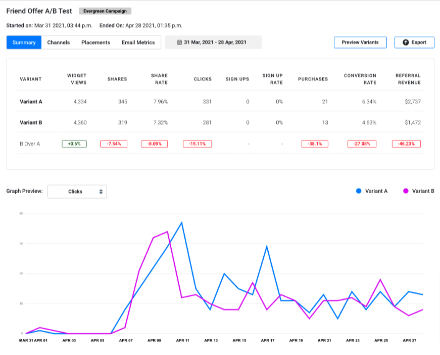
5. Use A/B Testing
All the elements of a referral page that we’ve discussed throughout this guide can be improved and optimized using A/B testing.
A/B testing is a method of marketing that requires the development and testing of two variations (A and B) of a given campaign or element. The results of the test are used to determine which of the variations is the most effective.
Why is this important?
There are tons of benefits to A/B testing across many applications. But in terms of landing pages, A/B testing can have a significant impact on the success of your referral program.
For example, you may want to test how a change to the copy of a given CTA affects conversion rates. In this scenario, you would use A/B testing to develop and test two different versions of your CTA’s copy.
For instance, variant A (the control) may simply say: “Refer Your Friends And Be Rewarded”. While variant B (the challenger) could talk about the specifics of the referral incentive, like this: “Refer Your Friends And Get $10”.
The results of these variations can be used to determine if the addition of specificity plays a positive or negative role in driving conversions—and which variant you’d like to use moving forward.
But what if you want to test how a slight change to the placement of your CTA button can affect conversion rates?
In this scenario, you can use A/B testing to create two different versions of your referral page. The first page is a control, with all referral elements remaining the same. While the second variation features the CTA button placed in a slightly different spot.
Once the test is complete, you can compare conversion rates between the two versions and draw conclusions about the optimal placement of your CTA button.
Learn more: How to optimize your referral program with A/B testing
Friendbuy's platform allows you to A/B test different elements of a referral page, including headlines, description, formatting, and overall design.
Learn more: See how to run an A/B test on Friendbuy’s platform.
5 Experience-Based Tips to Increase Referral Landing Page Conversions
We've been doing this for awhile now and so we know what works and what works. Let the data above guide your decisions about all the things. But when it comes to how your customers will experience your referral program?
Think of referred visitors as VIPs.
They’re coming to your site because a friend is recommending your product or service. They’re already primed with ‘social proof.’ In that way, they’re special. Lay out a stellar referral landing page - your welcome mat - for these premium leads and they’re far more likely to turn into customers.

There are several options for engaging referred visitors. Let’s take a look at five tactics and real-world examples.
1. Direct referred visitors to your homepage
Sending invitees to your homepage is the simplest of strategies and a good place to start if you want to deploy your referral program quickly. We’ve recently seen a few startups looking to deploy refer-a-friend widgets in an afternoon prior to the day they received wide press coverage. Yup, some people are in a hurry!
While driving visitors to your ‘naked’ homepage is less elegant that the other methods covered below, it does carry the benefit of comparing the conversion rate of referred traffic versus other traffic (organic, CPC, etc.)
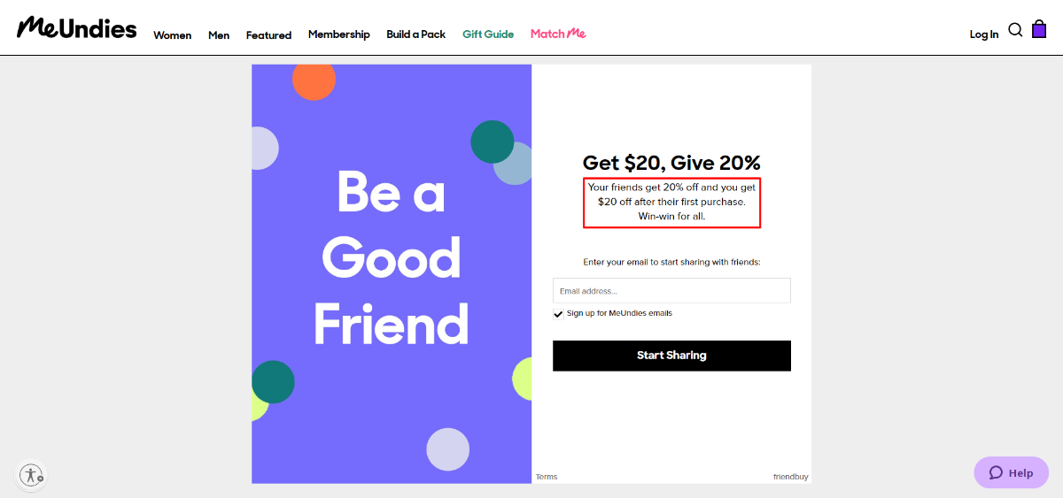
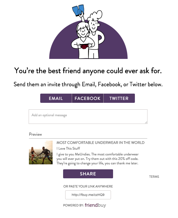
2. Present referred visitors with a welcome widget
Here’s a way to add some spice if you’re using your homepage as the destination for referral visitors - create a custom welcome widget that appears to users who click through a referral link. You can do this with a simple overlay widget. Feature your call to action and offer in the copy (obviously) to help move them through the conversion funnel.
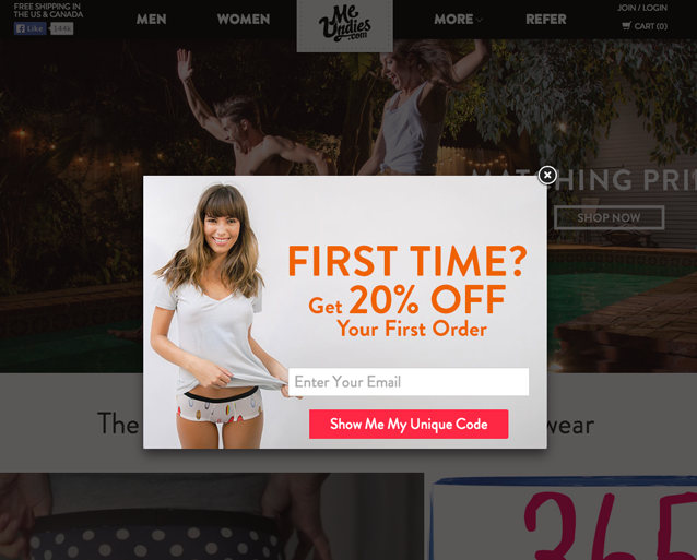
MeUndies does this beautifully with a custom welcome widget that pops up over their homepage. It combines an enticing referral incentive and email capture functionality for future communication. Even if the user doesn't convert, you've started a lead nurturing relationship - a win/win!
3. Generate a dynamic message in your referral landing page
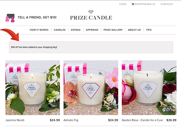
Prize Candle, using session-based information obtained from referral link UTM parameters, generate dynamic welcome messages that display the campaign incentive to the referred friend. What’s more, the incentive amount is deposited as session-based credit into the visitors shopping cart, “$10 of has been added to your shopping bag.”
This tactic reduces friction and keeps the carrot (offer) right in front of the prospect.
4. Use a dedicated referral landing page
Sending referred users to a dedicated landing page - created specifically for invitees - is a sophisticated approach to welcoming potential new customers. The customized experience speaks to referred visitors differently than regular customers and the feeling of “special treatment” helps drive engagement.
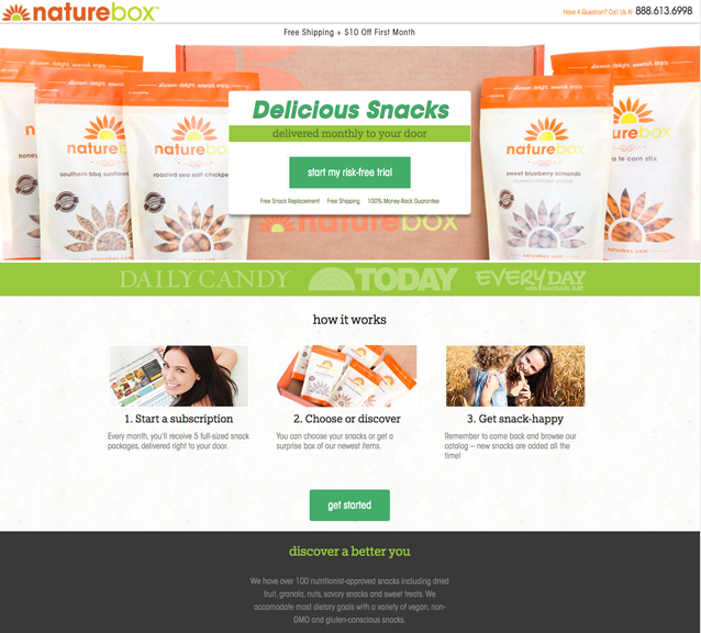
Naturebox welcomes their new customer referrals with a custom landing page featuring a strong, clear call to action. Notice how easy it is to identify how to get started. The content is tailored for new users and efficiently introduces Naturebox’s membership process.
Furthermore, click-able elements like navigation, social media icons or other distracting elements that can suck users away from the conversion goal are eliminated. This is a true landing page with all the requisite best practices included. The toll-free number is a nice touch, too.
5. Personalize the welcome experience
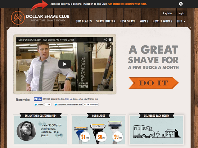
Dollar Shave Club serves up a customized welcome bar at the very top of their page that shows the name of the referrer. It reminds the visiting friend of their personal connection. Customizing the welcome experience keeps the process feeling intimate and exclusive.
This approach is also more advanced because it uses session-based info to generate the custom welcome bar – all of which can be tracked and evaluated to help you optimize your referral marketing efforts.
Friendbuy gives you the ability to A/B test and track all of your campaign elements to determine which welcome experience is most effective in turning referred visitors into new customers.
Need Inspiration? Here Are Some Referral Page Examples.
Good referral pages have a few things in common. They:
- Look good
- Have a clear call to action
- Provide a great UX
- Never force a user to login or register before sharing
The good news here is that #1 and #3 above are taken care of by using Friendbuy's widget templates. The call to action (#2 above) is in your hands. If you need help on CTAs, check out our blog posts how to write CTAs and evaluating calls to action.
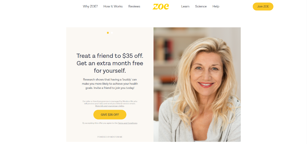
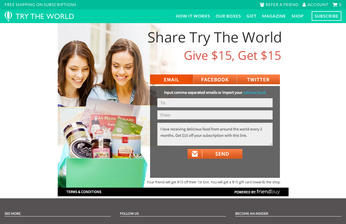
Try The World
- Referral Template: Sunset
- Referral Incentive: $15 store credit for referrer / $15 off for friend
Spartan Race
- Referral Template: Fairfax Landing Page (custom)
- Referral Incentive: Free race for referrer

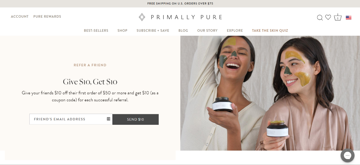
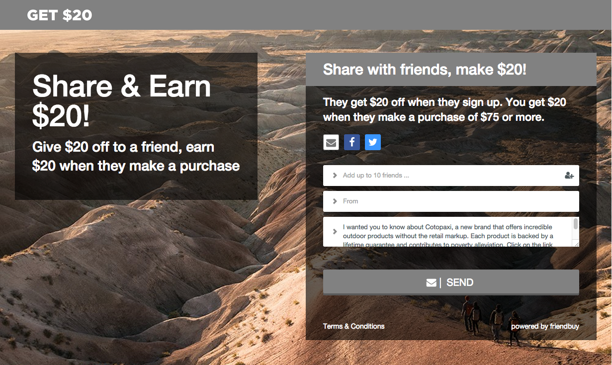
Cotopaxi
- Referral Template: Fairfax Landing Page
- Referral Incentive: $20 in store credit for referrer / $20 off for friend
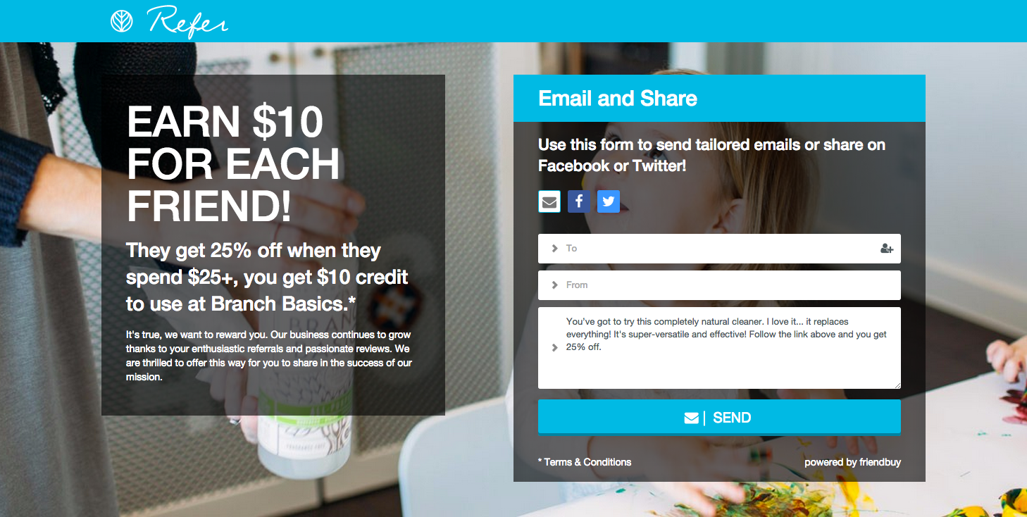
Branch Basics
- Referral Template: Fairfax Landing Page
- Referral Incentive: $10 for referrer / 25% off for friend
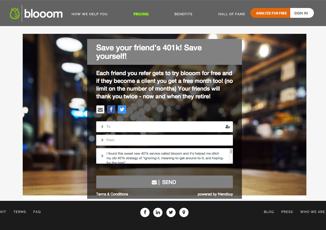
Blooom
- Referral Template: Fairfax Embed
- Referral Incentive: Free month for referrer / Free month for friend
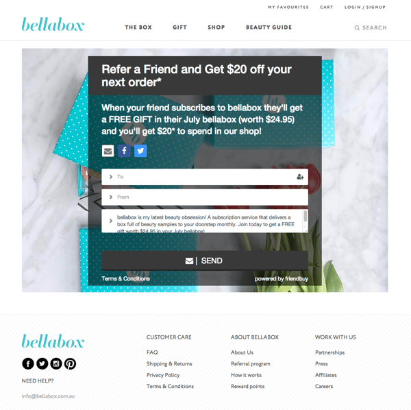
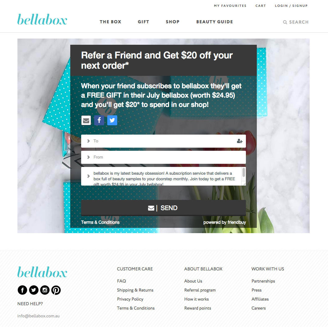
Bellabox
- Referral Template: Fairfax Embed
- Referral Incentive: $20 off next order / Free gift for friend
MeUndies
- Referral Template: Rodeo (custom)
- Referral Incentive: $20 in store credit for referrer / 20% off for friend
Make A Referral Landing Page in 5 Minutes
With Friendbuy, standalone referral pages take very little time and effort to create. All that is required is the following:
- Create a page on your site like yoursite.com/referral-page
- Pick a referral template and edit the widget your Friendbuy account
- Configure the widget settings to "embed"
- Paste the corresponding widget snippet into the unique page you just created. You'll probably want to center the widget, too. Just so it's pretty and all.
That was easy, huh? Now comes the fun part. Contact our Sales Team to learn how Friendbuy can increase your referral conversions and revenue.

