


Share this article
Table of Contents
With technology constantly improving, brands must continually test and iterate to improve the ecommerce user experience (UX).
What do we mean by UX? Robert Hoekman Jr., author of The Tao of User Experience, defines UX like so:
"User experience is the net sum of every interaction a person has with a company."
And why's that so important? A study published by researchers in Italy and Argentina argued that improving usability in ecommerce is essential for business growth. Furthermore:
"Higher usability is, in fact, a requirement to win the market competition and to retain customers from turning to other choices."
These researchers found a technique called refactoring to be essential in adopting new designs and technology. For those unfamiliar with this idea, refactoring applies step-by-step changes to the design of websites to continually improve its quality while still maintaining the key behaviors of the site. Think of refactoring as similar to the concept of iteration for conversion rate optimization (CRO)...
A great example of an ecommerce brand that uses refactoring to regularly improve their UX is Amazon. Jeff Bezos, the CEO of Amazon, says:
“If you do build a great experience, customers tell each other about that. Word of mouth is very powerful.”
Take a look at the Amazon.com you may remember:
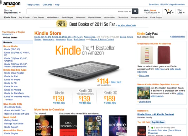
The big changes are the dark blue bar at the top of the page and a new dropdown menu on the top left that showcases Amazon's popular Fire and Kindle products more prominently.
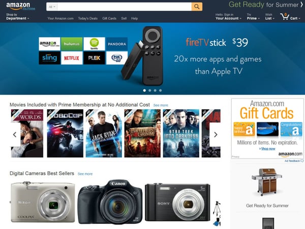
While this new iteration isn't as drastic as Amazon's 2012 major redesign, which made buying on mobile and tablets much easier, it's a good example of how Amazon uses refactoring to stay on the leading edge of ecommerce UX design.
The overall behavior of the site remains the same, but there are incremental improvements to their ecommerce store's usability - and that keeps Amazon a step ahead of their competitors.
In this post, we are going to show all the latest ways leading ecommerce brands are improving their UX - so you can improve the UX of your store, which will lead to more conversions and create amazing customer experiences. Which is what this is all about, right?
So let's start with the dreaded-by-some-adored-by-others topic of mobile UX...
Get Ahead of the Mobile Commerce Wave
Goldman Sachs came out with forecasts last year that projected that in 2018, there will be roughly as much mobile commerce sales as there was in all of ecommerce in 2013, which was $638 billion. And with mobile commerce experiencing a 45% yearly growth rate, creating an amazing user experience on mobile will be key to remaining competitive in the ecommerce game.
You can't ignore mobile.
Well, you can. But your bottom line will feel it.
So what can you do? What's the low-hanging mobile UX fruit, as it were?
First, if your store hasn't already, it's essential to invest in responsive mobile design: 30% of mobile shoppers abandon a transaction if the shopping experience is not optimized for mobile. (Tweet this)
Retail giant Walmart was ahead of the curve on this movement and has reaped the benefits of investing in responsive design early. With more and more of their traffic coming from tablets and mobile devices, Walmart looked to decrease load times - 57% of mobile customers will abandon your site if they have to wait 3 seconds for a page to load - and tested everything from banners to copy to product images to optimize their site.
They knew they needed to make it as easy as possible for their core customers - moms - to shop from anywhere with their phone or iPad.
So they developed a responsive design to make touch-centric sales easier:
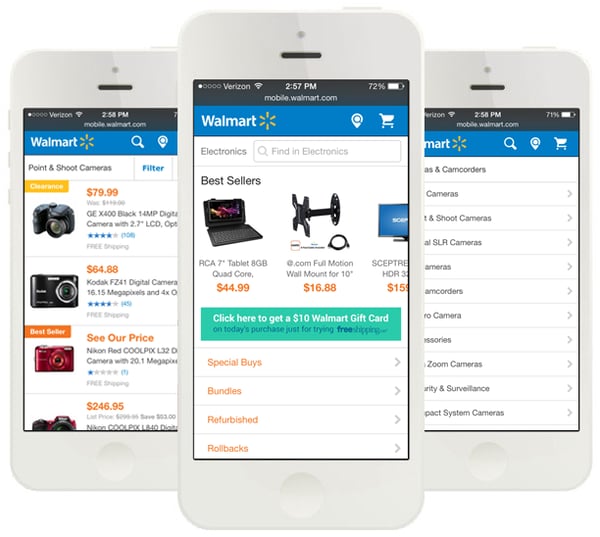
With the redesign of the UX of their site, Walmart was able to increase conversions by 20% on all devices. Even more astounding, mobile orders increased by 98%.
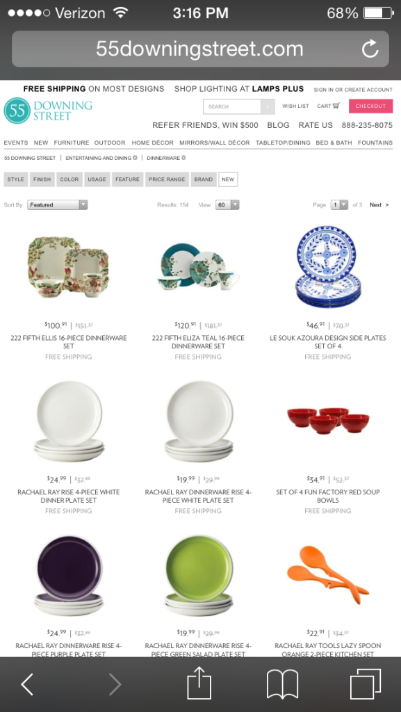
What you don't want is your mobile site looking exactly like your desktop site if your desktop site does not "shrink" well. Check out 55 Downing Street mobile site below. I don't know about you, but I don't know how anyone could accurately navigate their site without a microscope and a stylus...
Research by Microsoft, Nokia and Apple has shown that touchable elements on mobile need a minimum hit area of approximately 7×7mm, and spacing between clickable elements to be a minimum of 2×2mm. Essentially, your target (like a button or other tap-able element) needs to be very easy for uncertain fingers to acquire / tap. Without this UX, your customers are going to quickly give up trying to buy on your mobile site.
Now that we've shown you what not to do when it comes to designing the UX of your mobile site, here is Jimmy Choo to the rescue to show us how it's done.
Check out the desktop version of their site here:
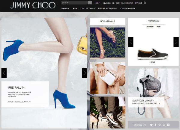
Their desktop site features a number of different clickable images that let you explore different categories of their store with top level navigation at the top.
Now check out their mobile version:
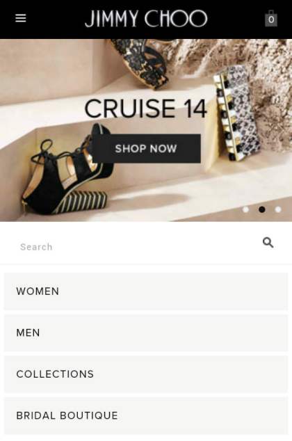
Unlike 55 Downing Street's mobile site, the Jimmy Choo mobile site is much different from its desktop counterpart. It features a few large category buttons, a search field, and a shop now button that takes you directly to their store to let you scan through their products. Easy to understand. Easy to use.
Ecommerce brands must also embrace mobile's limitations for product pages. Screen sizes are small, and as we've seen, simply translating your desktop layout to mobile makes for a subpar user experience. For example, Fancy, an ecommerce retailer that curates its products via its global community, has full-screen images for each of their products and uses a scrolling interface, allowing for limitless browsing.
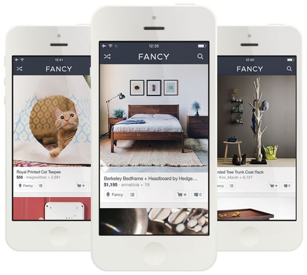
In addition, their product photos are all high-quality and their scrolling interface makes it addicting to browse their products, which is that stickiness that all ecommerce stores are striving for.
With 40 percent of consumers reported to turn to a competitor's site after a bad mobile experience, ecommerce stores simply can't afford to drop the ball with their mobile site.
Checkouts Must Be Pain-Free
In 2015, forcing your customers to create an account in order to make a purchase is a great way to get them to abandon their carts.
Instead, design the experience to be much more pleasant by:
- Asking customers to create an account right before they place their order
- Letting customers check out without creating an account
- Using social sign-in to create an account (one click!)
- Offering an incentive to create an account or enter their email address (getting that email address is why you really want them to create an account anyway)
In ecommerce UX, it's all about easing the pain of the online shopping experience.
The last thing you want to do is make creating an account a prerequisite for buying, like the ecommerce retailer below does.
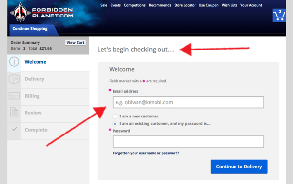
Instead, you can give your users a number of options to easily get past this step in the checkout process. For example, ecommerce flower retailer FTD gives their customers three different options when it comes time to create an account, as you can see here:
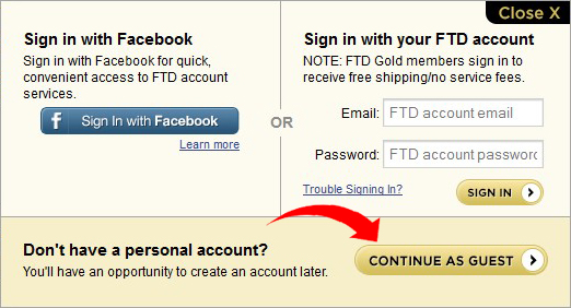
First, you can checkout as a guest without creating an account. Also, for those of us who hate filling out all those fields to create an account, they use Facebook's social sign-in so you can skip it. Last, you can become an "FTD Gold" member by creating an account, which will get you free shipping and no service fees on orders.
What's keeping you from making it easier for your prospects to opt in or out of account creation?
Keep Your Checkout Short and Sweet
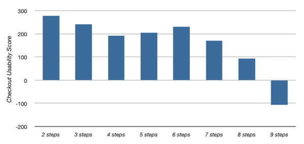
If you're not sure how many steps your checkout should be, take a look at this chart featuring how many steps the top 100 ecommerce retailers have:
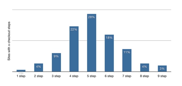
The sweet spot is 4-6 steps, with 28% of the top 100 ecommerce retailers coming in at 5 steps. So when going over your checkout funnel, always be thinking 6 steps or less.
And since the study we mentioned before hammered home the importance of website usability, let's also take a look at the usability scores of the top 100 ecommerce retailers based on the amount of steps in their checkouts.
Again, six steps seems to be the magic number for checkout steps, as there's a sharp decline in usability once you start hitting 7 or more steps...
But having the perfect amount of steps in your checkout doesn't mean much if your customers can't see where they are in the process. Make your customer's shopping cart present throughout their browsing experience so they don't have to click back and forth to see the status of it.
You should also make every step of the checkout process explicit like Amazon does below, showing each step from sign in to placing the order.
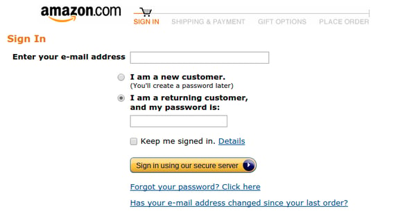
FACT: The researchers who performed the usability study mentioned at the top of this post found that a lack of information about the checkout process led to premature cart abandonment, so give your users map to the finish line!
Also, if you're using coupon codes to seduce customers, don't make it a pain for them to redeem them. Here are a few ways to make coupon codes easy peasy on your site...
First, if a discount is advertised on your site - for meeting a certain shopping cart threshold or whatnot - automatically apply the discount and take all of the manual labor out of it.
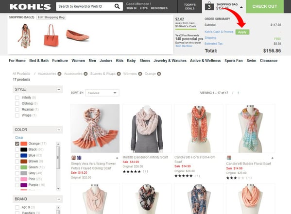
Second, make it super easy to apply discount codes long before your customers get to the payment page in the checkout process. For example, Kohl's allows you to enter coupon codes while you shop, simply by expanding the shopping bag and clicking the "Apply" button. (It also shows you what is in your cart.)
Think about how excited you were the last time you had a coupon for a store you liked. Don't inadvertently quash that excitement by making it difficult to redeem coupons or you may find your abandonment rate increasing.
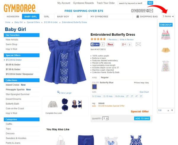
Product Grouping Is the New Black
Amazon's product recommendation system has long been lauded in ecommerce circles, and for good reason. Forrester estimates that Amazon's conversions of on-site recommendations could be as high as 60% in some cases.
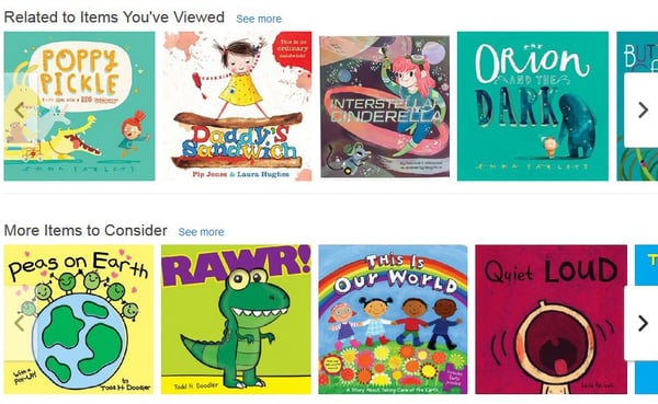
For smaller ecommerce retailers that cater to a specific niche, creating a product recommendation system on par with Amazon's may not make sense. But that doesn't mean you can't come up with creative ways to cluster your products and increase incremental sales in your store...
Savvy ecommerce stores have developed new ways to group their products that are intuitive and easy on the eyes to boot. Take a look at how etailer Jack & Jones clusters their clothes, allowing customers to create their own outfits rather than purchase individual items:
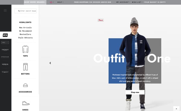
Who doesn't like putting together outfits before a night on the town? Jack & Jones gives their customers the ability to do this in their store with great graphics and easy navigation. And with customers focused on putting together several items rather than a single item, they are also helping increase order sizes.
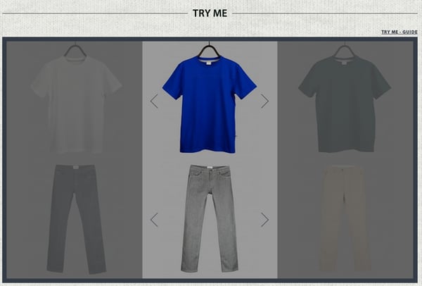
Similar to Jack & Jones, Bonarium, a young men's luxury brand based in Paris, has created a 'Try Me' feature in their store that acts as an online dressing room for all their merchandise. It's a tool that is fun to experiment with and makes it hard to checkout without buying a new outfit... or seven.
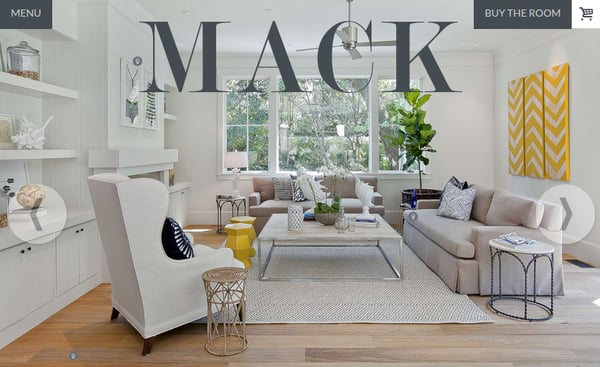
Mack is a furniture ecommerce brand that does an amazing job of designing rooms with their products and then making them all clickable to buy - even giving their customers the option to "Buy the Room." Talk about an upsell!
If you're already thinking of ways to group your merchandise but aren't a clothing or furniture ecommerce brand, not to worry. Think about the ways your products interact with each other, or how your customers use your products in real life to create scenes or groupings that are logical extensions of your ideas.
As you can see, ecommerce UX design is continually evolving, requiring ecommerce stores to stay on their toes to keep their customers coming through the turnstiles. The name of the game now is making incremental improvements to the usability of your store instead of investing large amounts of resources every few years to rollout a complete redesign.
Improved UX design is often responsible for a lot of the CRO gains ecommerce stores see by filling in the gaps data-driven marketers often fail to see. So it's not a question of whether you can afford to improve UX, but if you can afford not to.
What are you doing to improve the UX of your site?
