Table of contents
Join our Community!
Oops! Something went wrong while submitting the form.
Stay up to date with the latest insights, trends, and tips for growing your business through referral and loyalty programs. Let's stay connected!


Referral emails are our bread and butter. Over the years, we've developed a set of referral email best practices for our customers so that they can get the biggest bank for their buck when sending emails to their customer base.
Just like web design, referral marketing success is built off the back of conversion rate optimization (CRO) framework best practices. This includes the location of referral email elements, their color, text weight, and various other design factors that take advantage of human behavior and cognitive biases.
For Friendbuy customers, we have this baked into our onboarding process. We use your branding guide to create highly optimized email templates for each of the referral marketing campaigns you choose to run.
Here are the principles that, according to the CRO framework, apply to referral program emails.
A subject line allows recipients to make a judgment call about whether they wish to open and read an email or discard it.
What does an open-worthy subject line look like in terms of referral emails?
Research shows concise, punchy subject lines increase open rates. Short subject lines allow the recipient to determine what the email contains and whether it is relevant to their interests. Concise subject lines are also less likely to be cut off by an email preview, allowing the recipient to see the full message.

In this example, you may have also noticed a few emojis.
This is no coincidence.
As reported by Business Wire, when compared to text-only subject lines, emails with subject lines that contain emojis experience a higher read rate. The same research found that the use of emojis within a subject line reduced the likelihood an email will end up in a recipient's trash folder.
For example, Valentine's Day emails that contained the 👄 emoji not only drove higher open rates but experienced an 89% inbox placement rate compared with an 83% placement rate for text-only subject lines.
To help you create click-worthy referral email subject lines, here are a few examples (that you are welcome to use):
To create effective subject lines, use catchy phrases, be specific about what the email contains, and use numbers and statistics.
You can see this in practice here.
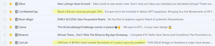
The highlighted subject lines use emotional cues like, "Bitcoin revenue plunges 34%" or "A $190m hack reveals the extent of crypto's security problem."
Another common practice is to use power words that evoke an emotional response.
Just like these highlighted subject lines. Phrases like "new listings" or "early access" work well.
Using power words and phrases works on a psychological phenomenon called emotional argumentation - a persuasion technique used across many marketing ventures, including referral marketing.
This is when a simple A/B test on your subject lines might come in handy. You can test different power words, specific phrases, and even subject line copy formulas to see which final subject line gives you the highest open rate.
Your click-worthy subject line has done its magic. The customer has opened your referral email.
Now, you've got literally seconds to convince them not to hit the delete button. But you won't accomplish this if the email's copy is too long-winded and complex.
Instead, aim to keep things tight, concise, and straight to the point.
Metromile is a great example of referral marketing done right. Their referral program emails are tight, concise, and to the point.

Not including the titles and disclaimer at the bottom of the email, there are six sentences that give all the details a potential participant needs to participate in Metromile's referral program.
We've covered it, but to really drive the point home - it's to sound like a human. Ideally, make the reader feel like they are receiving an email from an old friend.
The best way to do this?
Be conversational by using second-person language. Use pronouns like "you" and "your".
The Burrow team has mastered the use of conversational copywriting.
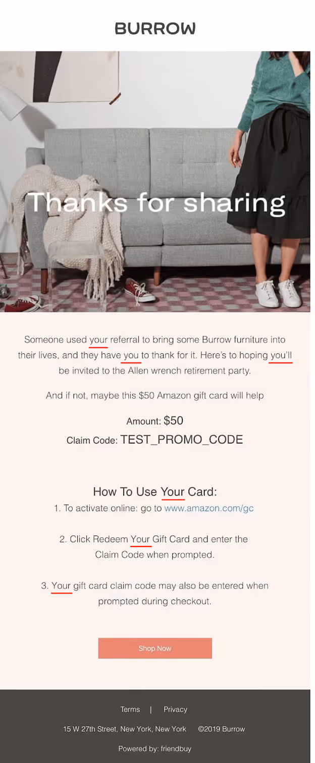
The choice of words, and addressing the reader directly, evokes an emotional connection with the Burrow brand. Removing the computer screen (or mobile device) and establishing a direct connection between brand and customer.
A touch that you, the reader, will no doubt appreciate.
By providing a clear call-to-action, you'll significantly increase the likelihood that customers will follow through with a desired action.
So what exactly should a CTA button look like?
In terms of aesthetics, color is the most important element.
Red is widely considered the best color for CTA buttons as it evokes feelings of energy and action, although this isn't a hard-and-fast rule. Adjustments can be made to match your branding.
Learn more about writing calls-to-action.
Friendbuy Example: Spanx
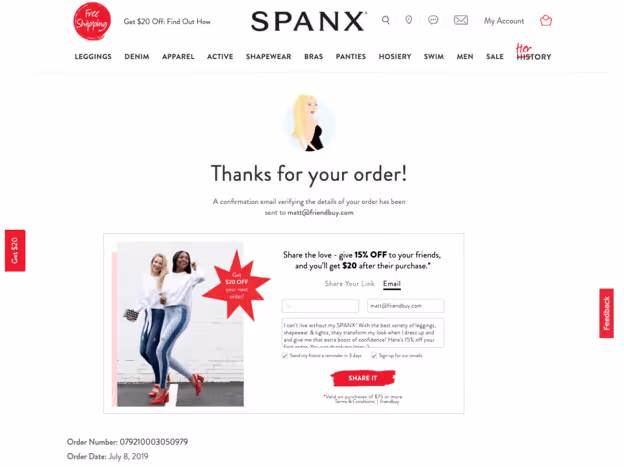
Spanx uses red to draw attention both to the website banner as well as the widget CTA where it says "Share It".
Just like red evokes an emotional response, so do other colors.
For instance, research has shown the color green elicits feelings of wealth and confidence. Perfect for businesses selling financial services.
Friendbuy Example: Quickbooks

Quickbooks uses green to elicit trust and confidence in their brand, making it an easy (and safe) choice to join the referral program.
For deeper insight into color psychology in marketing (and more CRO principles), see our referral marketing best practices.
A pre-designed email template will save you the hassle of creating a fresh referral email from scratch every time a new campaign is launched.
It will also keep your branding, layout, and tone consistent. Contact us
Oh, and also boost conversions.
An effective referral email template contains the following elements:
To help you get the good word out about your referral program, here are a couple of handy templates to get you started (feel free to copy and paste):
Image: 🖼️
Heading: "[Discount]% off for everyone"
Body: "For every friend or family member you refer, you'll both receive a [discount]%. There is no limit to the number of people you can refer, so simply click the button below and start spreading the word!"
CTA: "START SHARING"
Heading: "Special offer: $ [amount] for you and your friend"
Image: 🖼️
Body: "It's easy - simply refer your friends and family members, and we'll give you a $ [amount] credit for each person who signs up. The best part? There's no limit to how many people you can refer.
What are you waiting for? Start referring today and start earning!"
CTA: "SHARE NOW"
If you'd like to read more helpful tips, see our referral email template guide here.
Forty-seven percent of people use a mobile device to check their emails, so if your referral emails are not mobile optimized, then you’re missing out on a lot of referrals that could be made.
To avoid any mobile-based catastrophes, optimize your emails so that the referral program email elements like images, text, and fonts appear as you expect them to. An email preview tool can help you spot any formatting issues.
The Friendbuy touch: Friendbuy's integration with Klaviyo automates referral program communications, including mobile-optimized emails. Klaviyo automatically optimizes the appearance of your referral emails. That way, when a user views them on a mobile device, the styling, formatting, and functionality of elements within a referral program email appear and work as you'd expect.
If you'd like to learn more about Klaviyo's mobile optimization capabilities, check out their mobile email optimization guide here.
When we talk about sending email blasts to your entire email list, it’s important to mention email list hygiene. Referring to removing invalid, duplicate, or unengaged profiles from a referral program email list can help you maintain good hygiene. Poor hygiene can negatively impact the deliverability rate and cause your emails to end up in spam folders more often than not, including your referral program emails.
If you'd like help to clean your referral program's email list, head on over to Klaviyo's guide to list cleaning.
Believe it or not, sending emails at different times of the day (or night) impacts open rates, click-through rates, and click-to-open rates — the percentage of recipients that opened an email and subsequently clicked a link within it.
A recent analysis of over 2.85M emails by GetResponse revealed some interesting insights.
During their research, somewhat unexpectedly, GetResponse found that sending emails during the wee hours of the morning achieved the best open rates, click-through rates, and click-to-open rates for both the US and Canada.

As for which day of the week yields the best results, Monday through Friday returned similar success. The weekends experience a slight drop off in terms of both open rates and click-to-open rates.
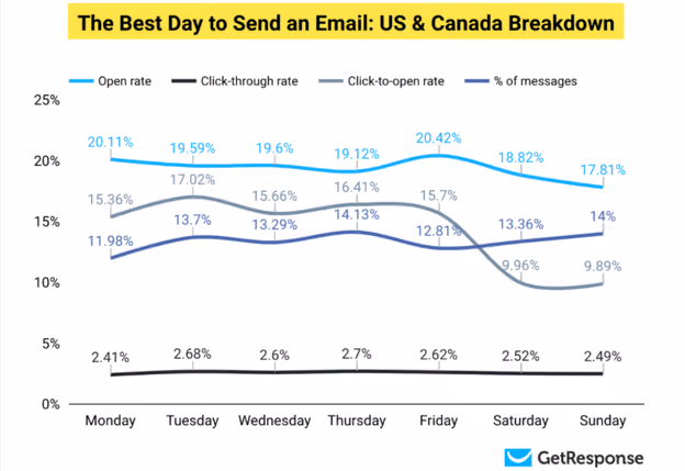
With these findings in mind, it's within your referral program's best interest to schedule emails early morning, Monday through Friday.
While this is helpful as a starting point, this isn't a hard and fast rule. We recommend using A/B testing to determine which time or day your customer base responds best to.
Our team of experts are ready to help you launch a robust referral marketing strategy. Contact us today to get started.


.avif)